UX/UI Case Study
Central Online
Improving checkout and coupon visibility for a promotion-led department store shopping experience.
About
Central Online is the e-commerce platform for Central Department Store, offering a curated mix of Thai-made products and international brands. My scope focused on the checkout experience and coupon redesign. The coupon work was still in progress when my role ended, but the exploration helped define how promotions could become clearer and more valuable throughout the shopping journey.
Opportunity
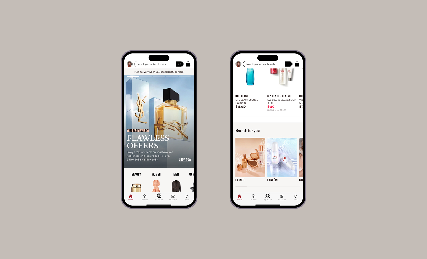
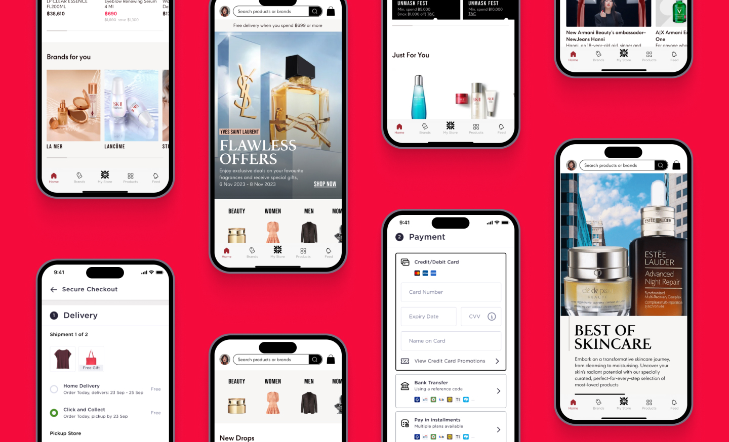
The primary objective was to increase the visibility and appeal of promotional offers, including discounts and gifts with purchase, across the full online shopping journey. Rather than limiting these incentives to isolated campaign moments, the goal was to make them visible from the homepage through product discovery, cart review, and checkout. This created an opportunity to build a more value-driven shopping experience that encouraged customers to explore more products, understand available benefits, and feel more confident completing a purchase.
Design Strategy
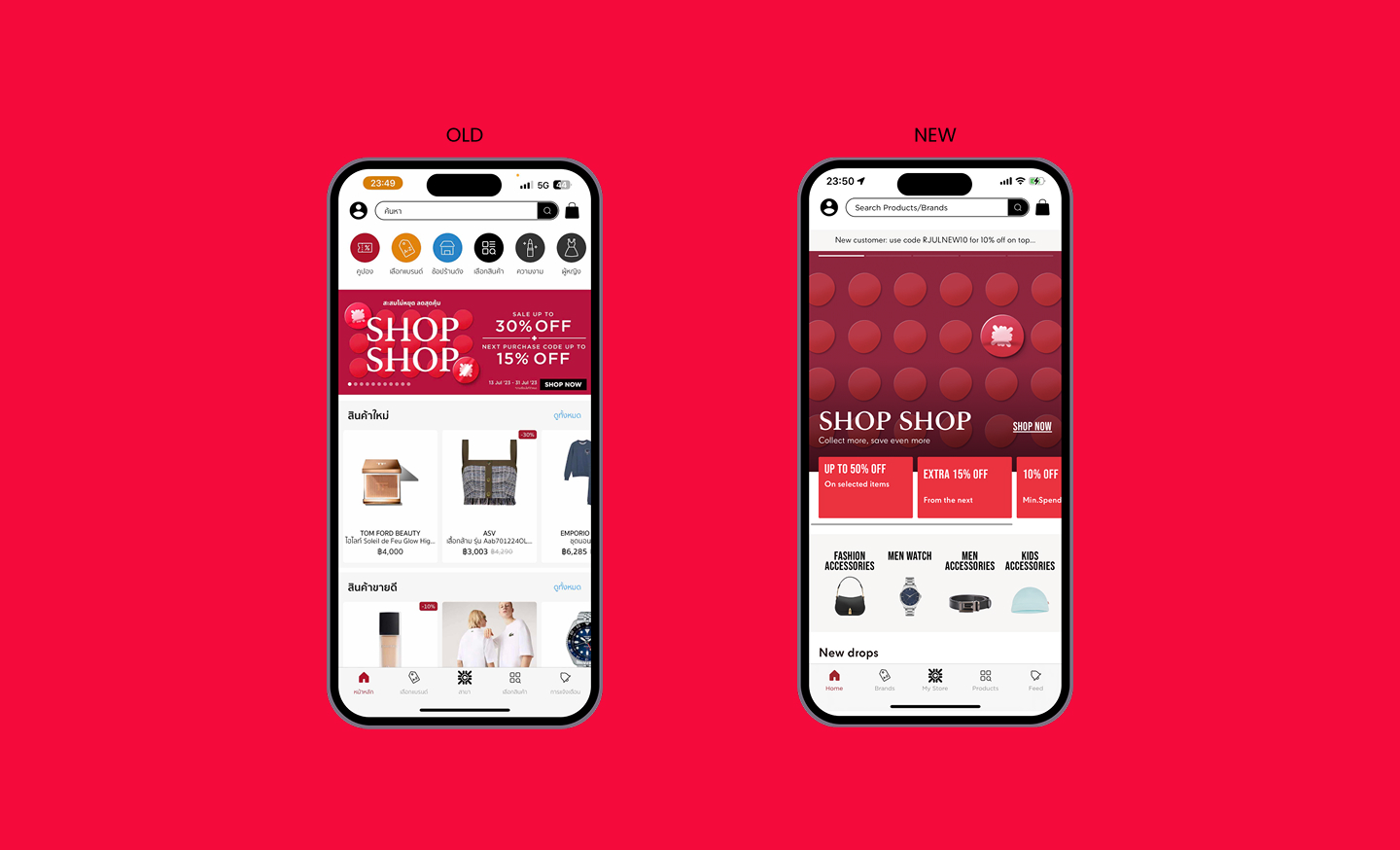
Central Online has gone through several redesigns over time. Earlier concepts leaned toward Western design principles, with a clean and minimal visual approach. Through iteration, we recognized that many Thai customers expect richer pages with more visible information, especially when comparing products, promotions, and purchase benefits. The latest direction balanced modern, streamlined layouts with information-dense presentation. We focused on improving the user journey through clearer navigation, refined product categorization, more visible promotional messaging, and checkout interactions that better matched local shopping behavior.
Findings
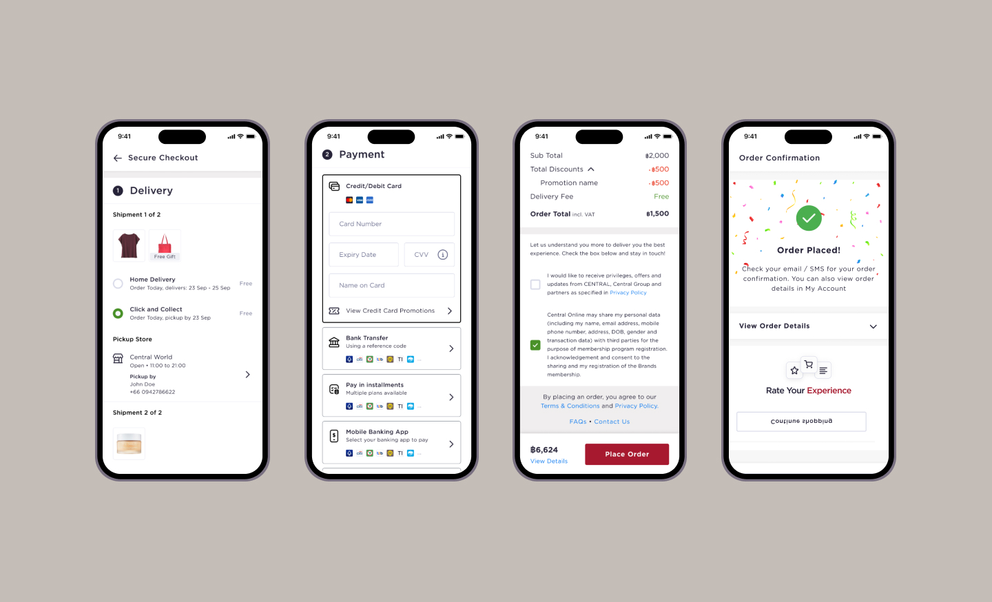
UXCam sessions showed that many customers experienced friction during checkout. One important accessibility issue appeared among older customers who used larger system font settings on their devices. The interface did not always adapt well to those settings, which could make checkout content harder to scan, reduce clarity around key actions, and create layout pressure in important decision moments. This pointed to the need for more resilient responsive design, stronger support for dynamic text sizing, and clearer checkout hierarchy.